Bringing to life a landmark new film center
Since its inception in 1999, the Maryland Film Festival has grown into one of the nation’s premier small film fests. In 2017, following an $18 million fundraising campaign, the Festival expanded to operate year-round in a beautiful new three-screen movie theater. Our team completed an extensive rebrand of the organization and the design of environmental graphics, wayfinding, and signage throughout the Festival’s award-winning SNF Parkway Theatre.
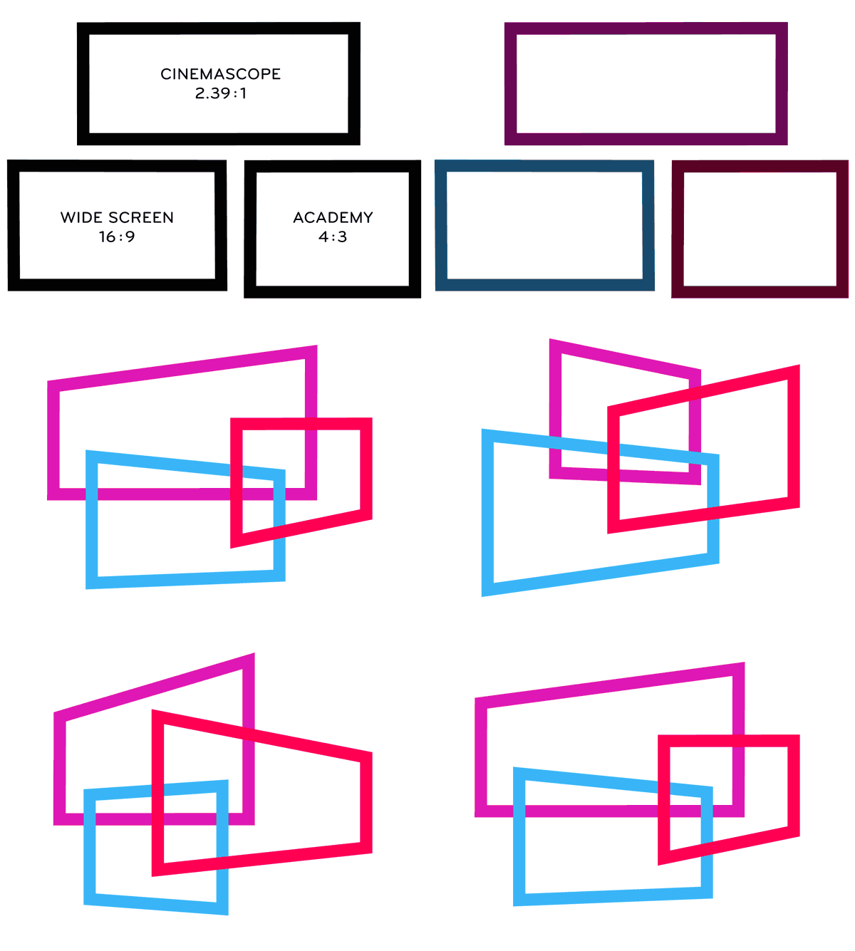
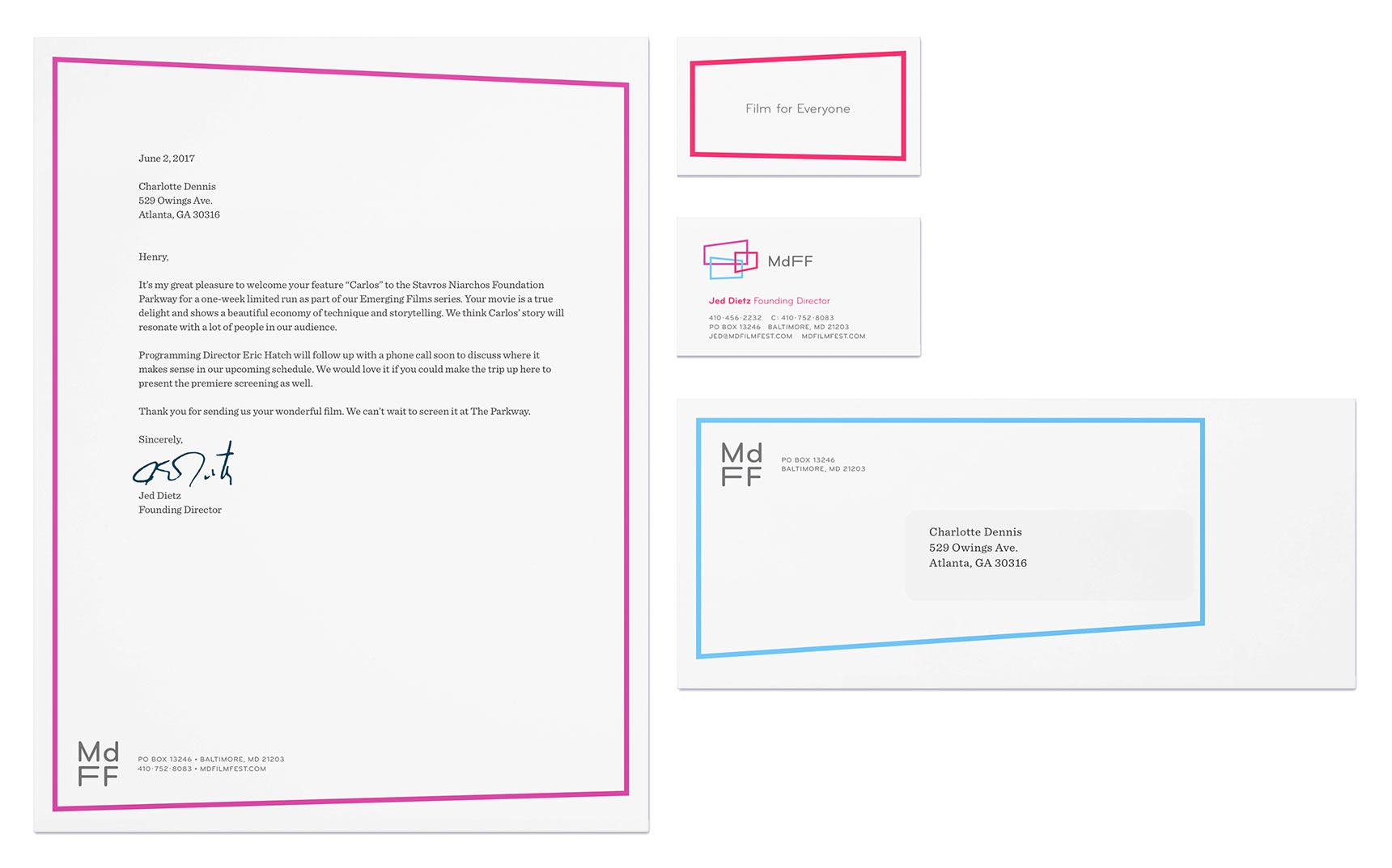
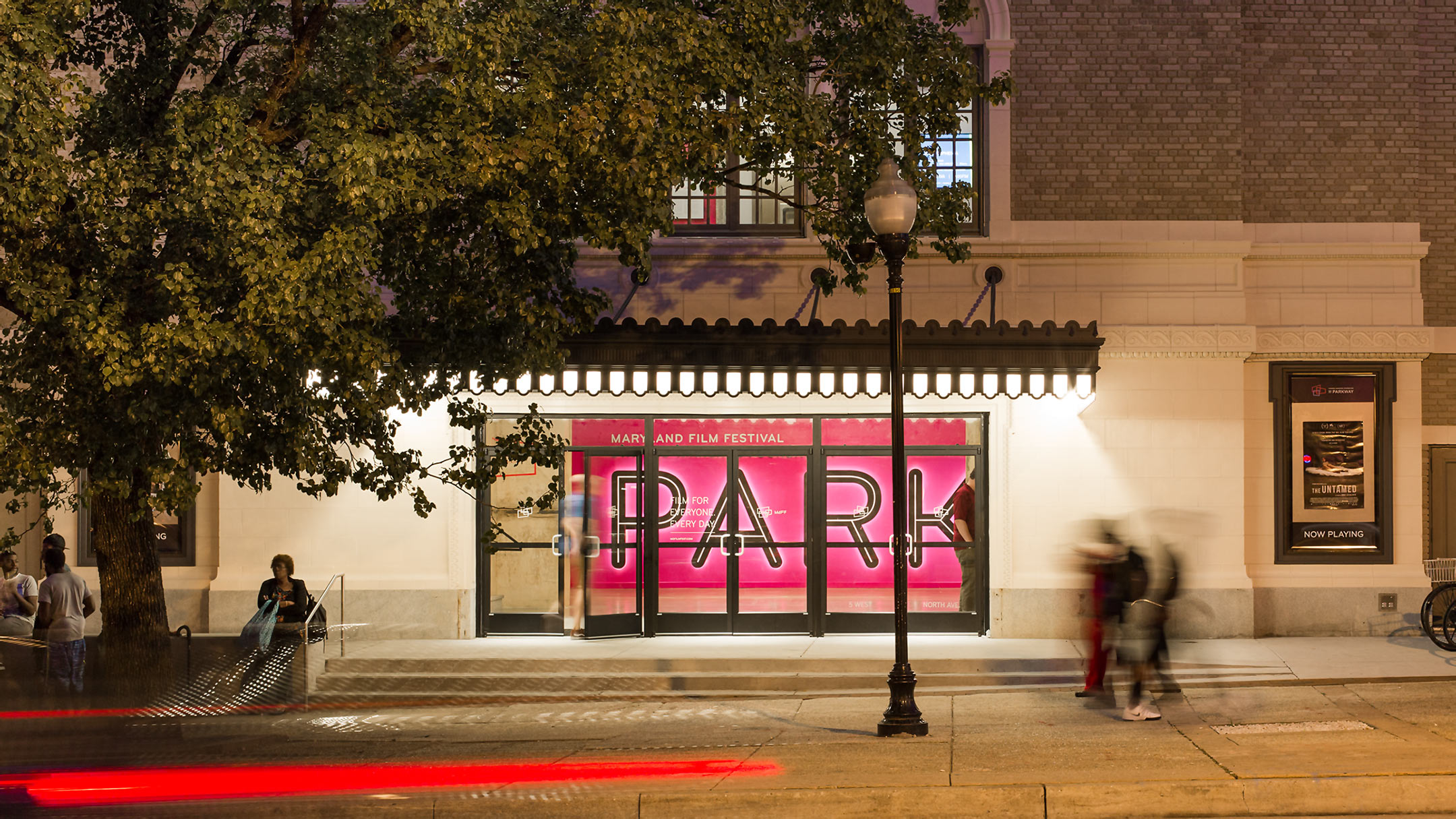
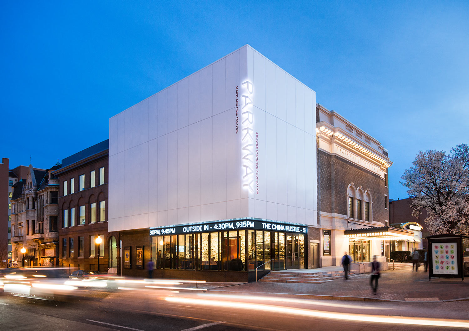
Our experiential design for the SNF Parkway accents the theater’s architecture with MdFF’s new branding.
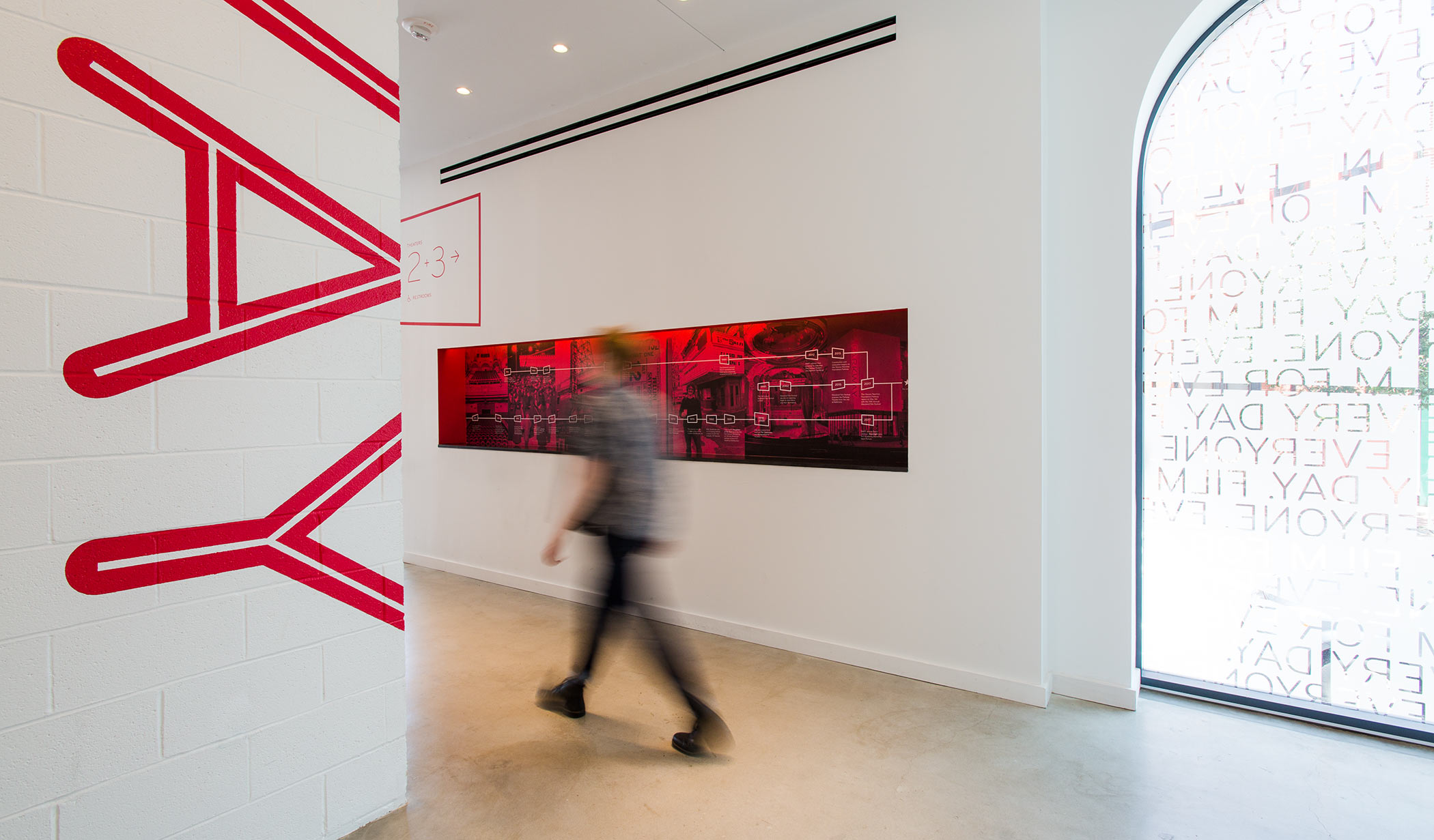
Ziger/Snead Architects’ unique approach to Parkway celebrates the building’s 100 years of opulence, decay, and reinvention. Assertively modern interventions mix with a century of history, resulting in a “rescued ruin” that interweaves past and present.
Attention-grabbing signage
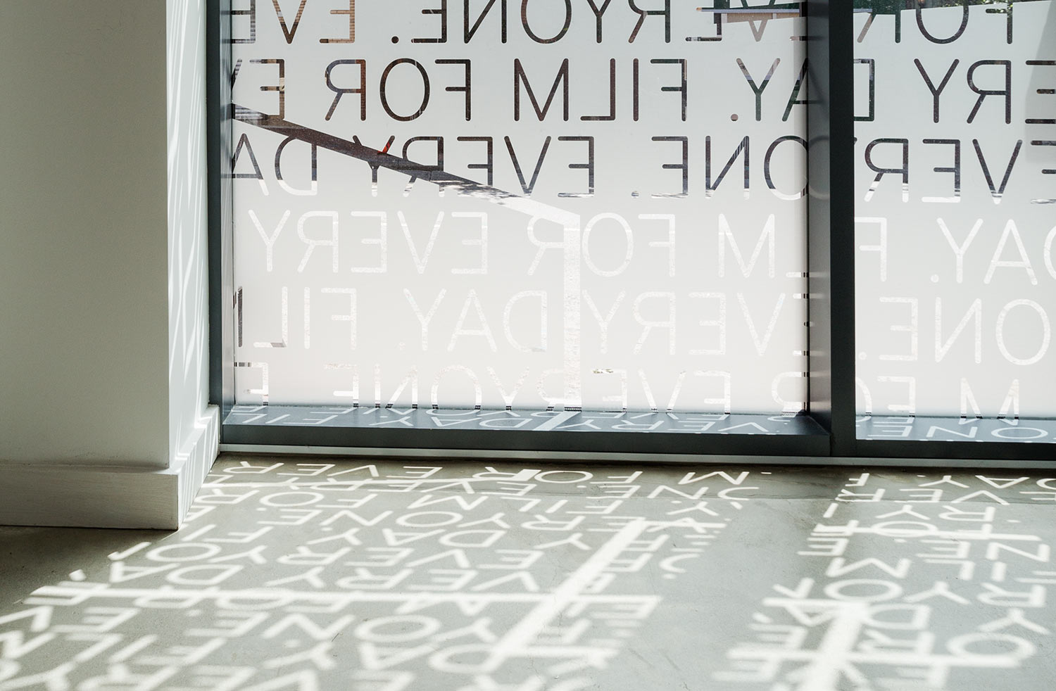
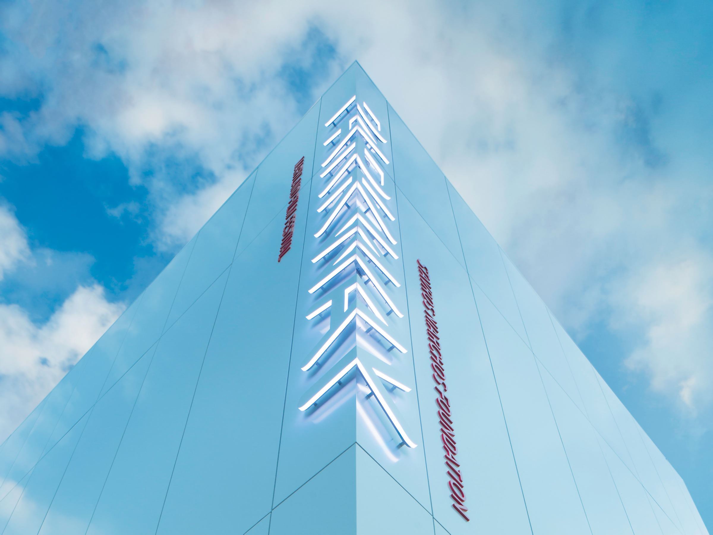
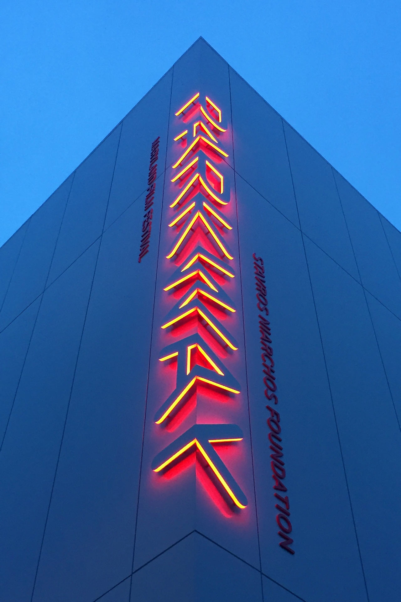
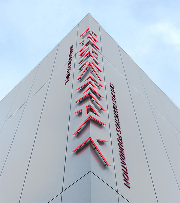
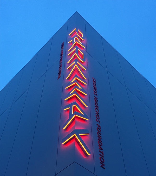
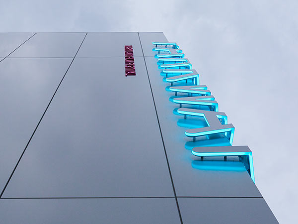
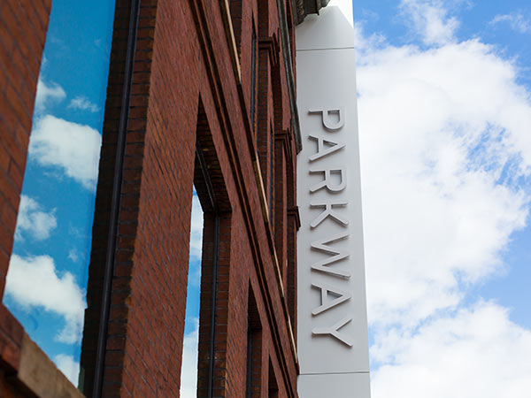
Our team emphasized the new-meets-old architecture with a white-on-white sign that wraps around the corner of the new building. This sculptural signage has become a recognizable landmark on one of Baltimore’s most prominent corners. At night, the sign glows with subtly shifting colors.
An enchanting interior
We created a visual focal point in the main lobby with six-foot-tall illuminated steel letters against a long wall of MdFF’s signature fuchsia. This monumental sign draws visitors into the space, making moviegoers feel like they’ve arrived someplace special.
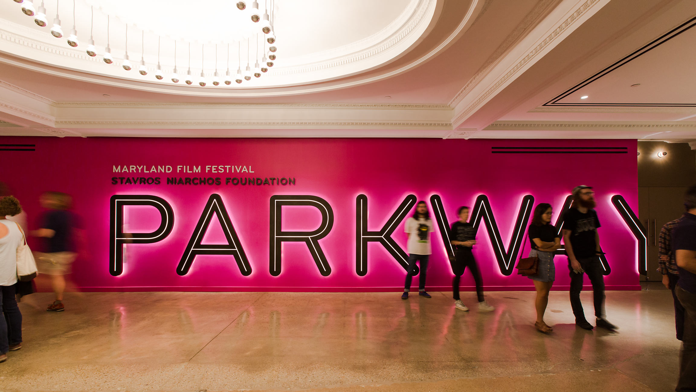
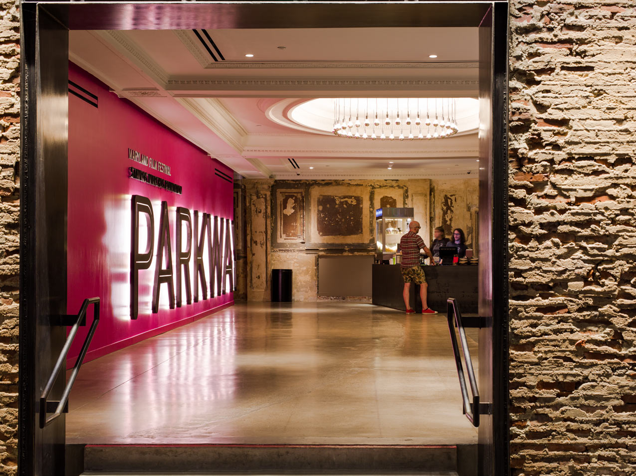
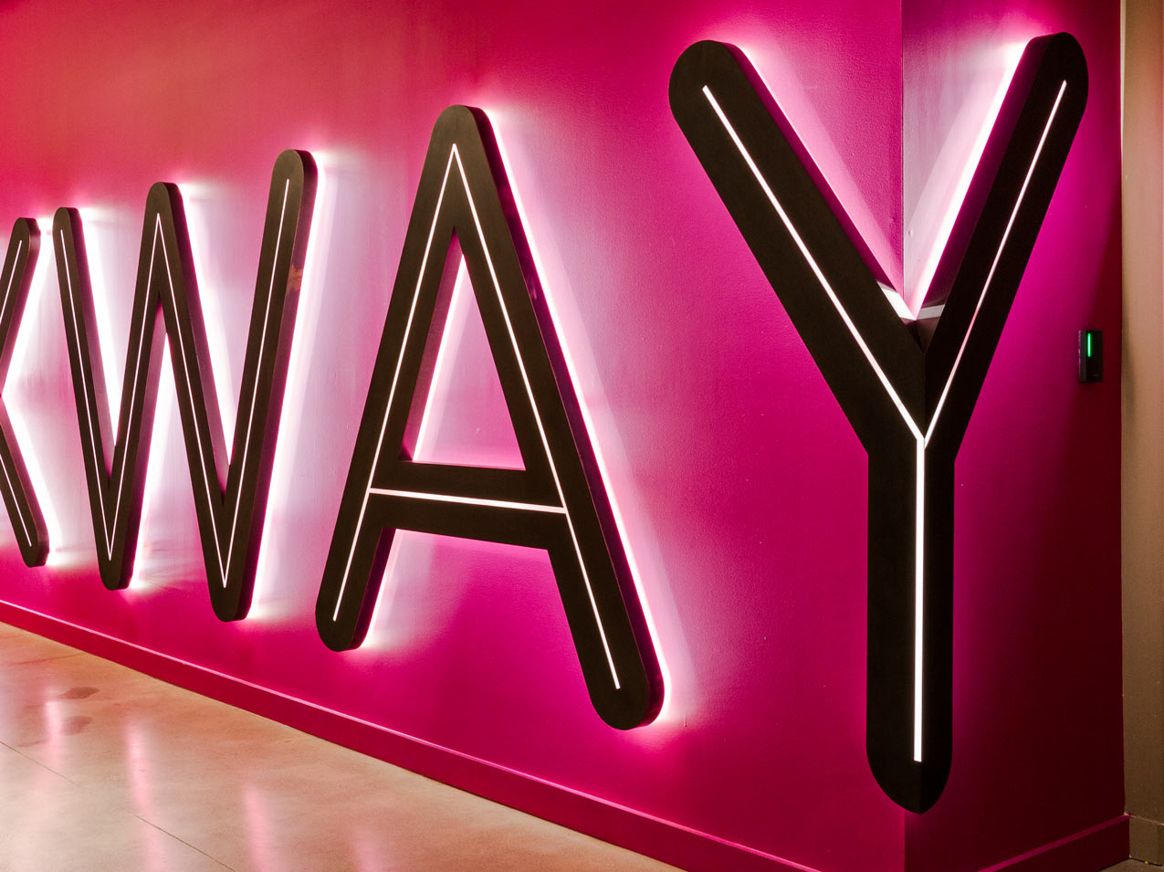
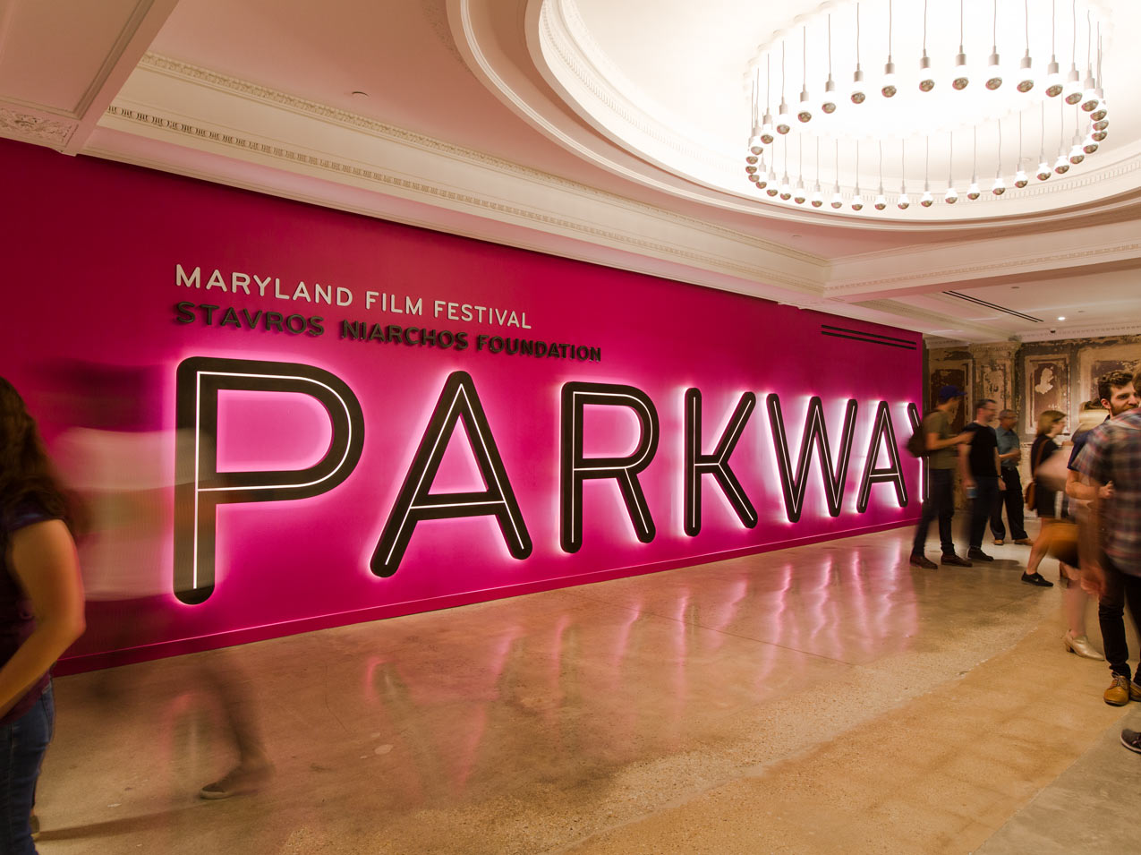
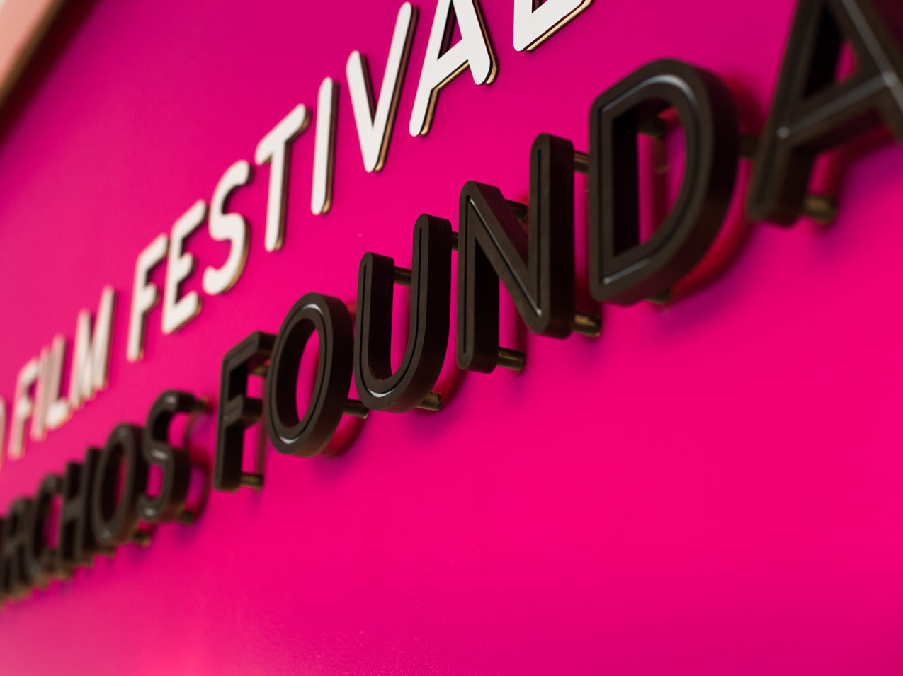
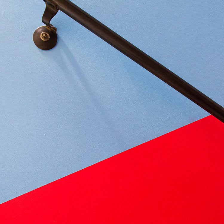
Our design introduced hits of vibrant color to contrast with the muted shades that predominate in the historic building. These bright colors help energize the space and delineate between new and preserved surfaces.
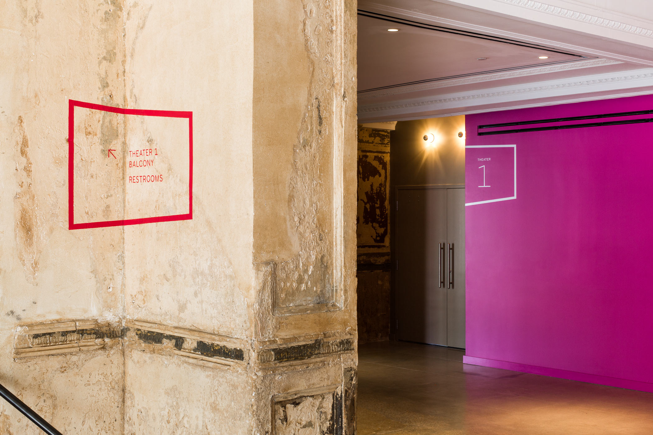
Dynamic wayfinding signage
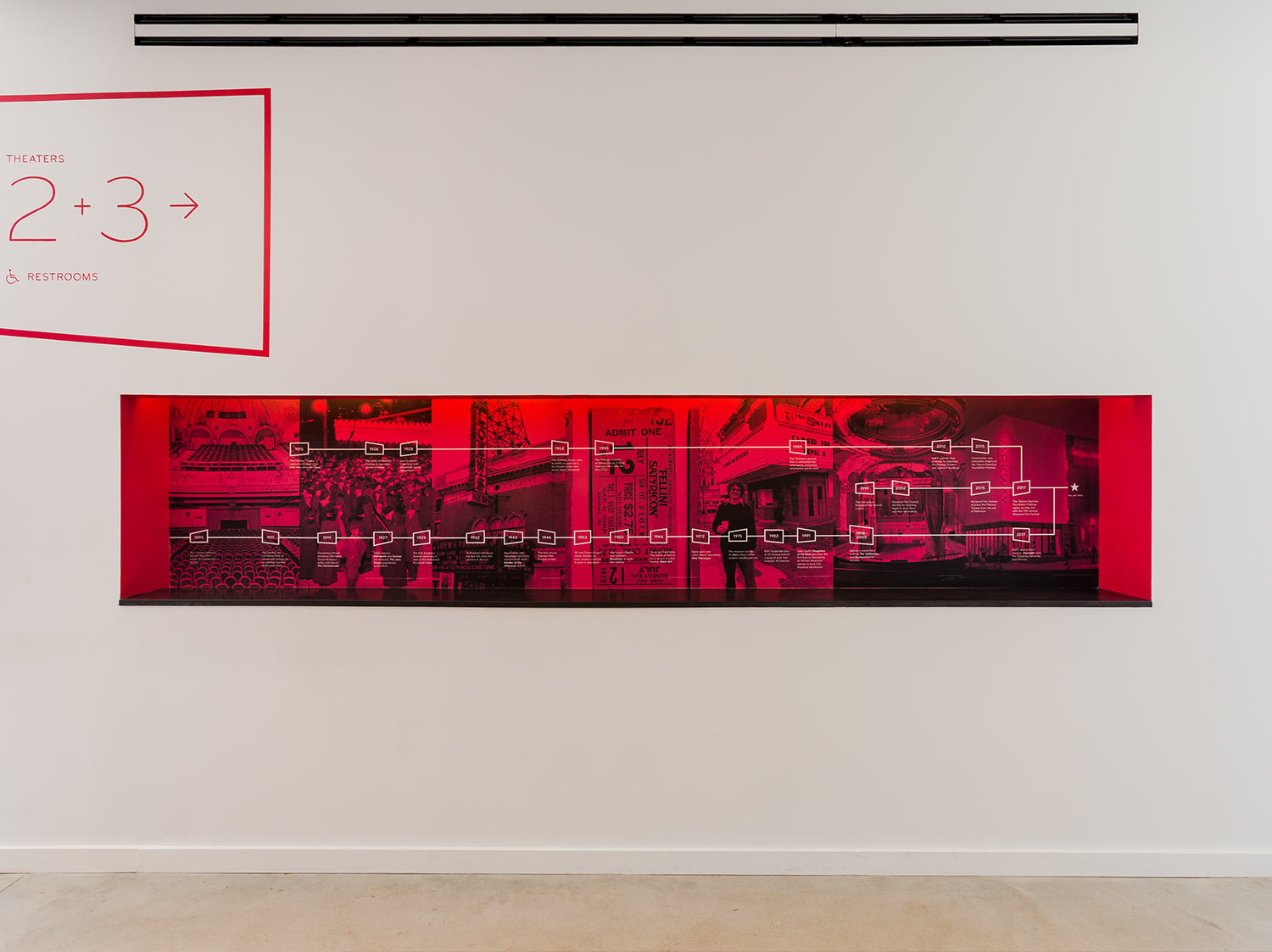
Wayfinding graphics play a leading role in the experience of visiting the Parkway. Prominent directional signage guides visitors through the 100-year-old building’s complex floorplan. Cinematic frames project across wall planes and textured surfaces and highlight architectural details. We painted these wayfinding graphics directly onto the walls, adding a new layer to the palimpsest of history in the historic building.
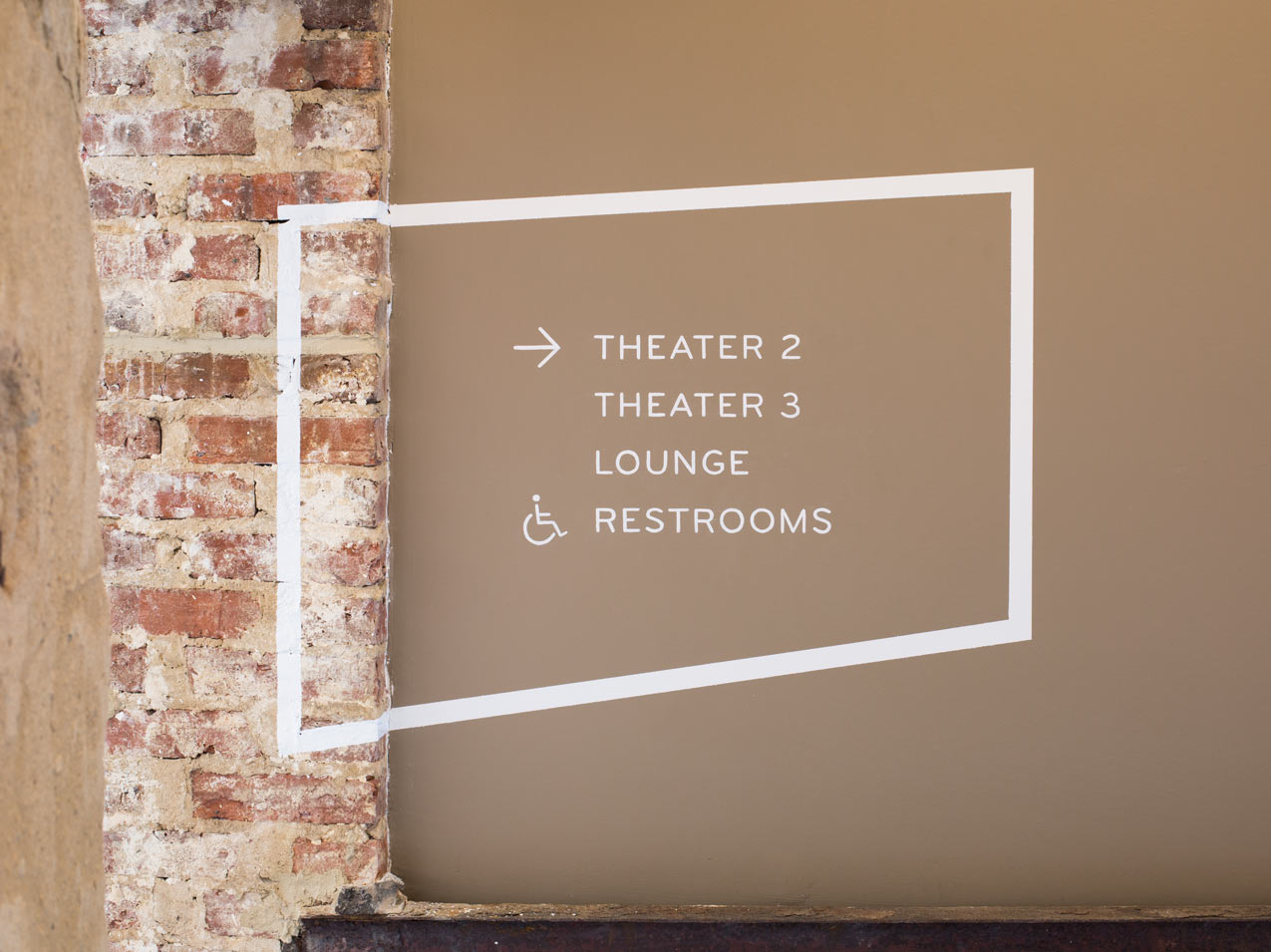
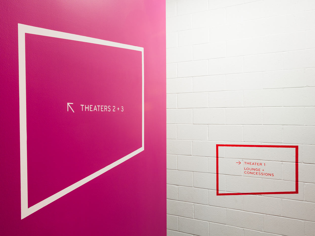
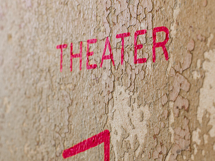
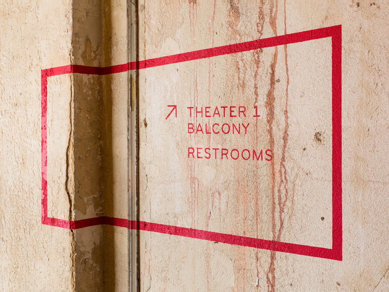
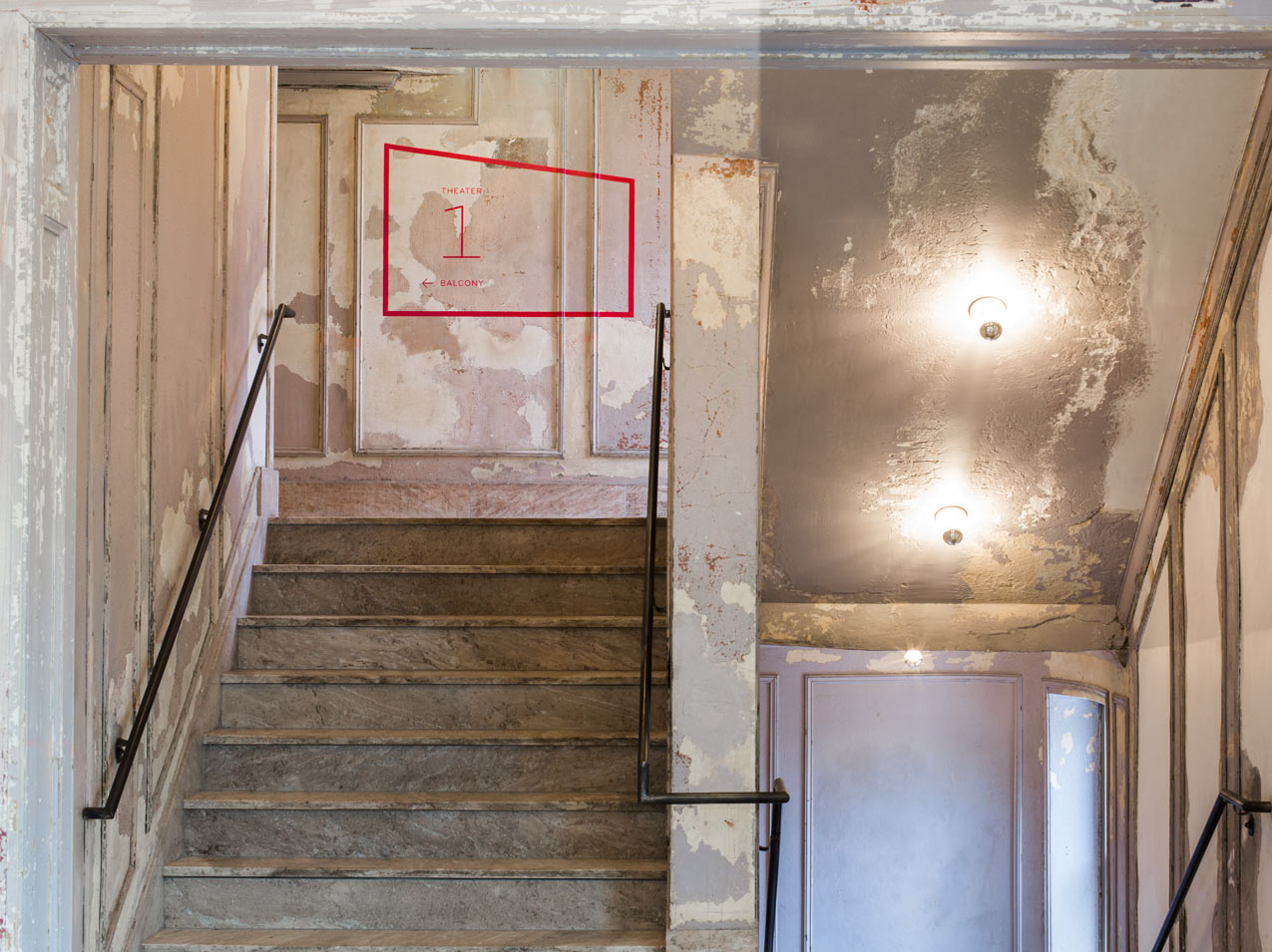
Striking environmental graphics create moments of discovery throughout the building.
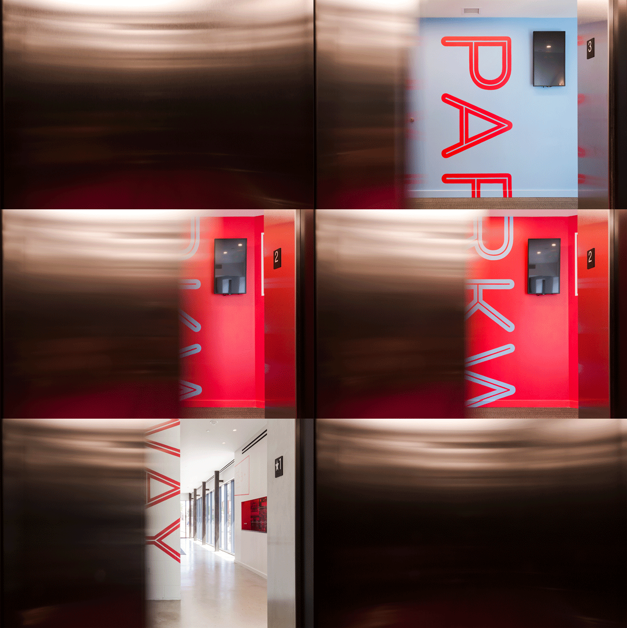
Going up…
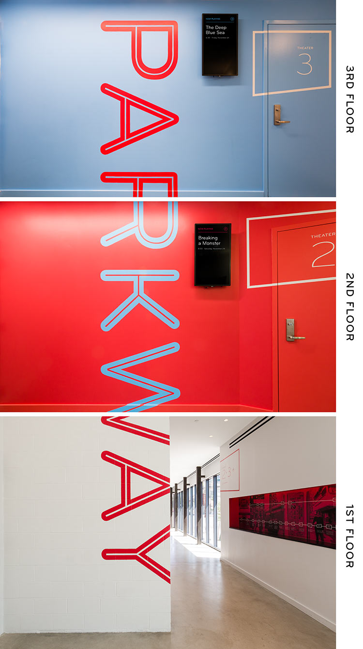
Theaters 2 and 3 are reached by either stairs or elevator. A giant Parkway logo spans the full three floors of the building, with the elevator doors creating cinematic crops or “edits.” Bold accent colors coordinate with theater upholstery and act as a secondary wayfinding element.
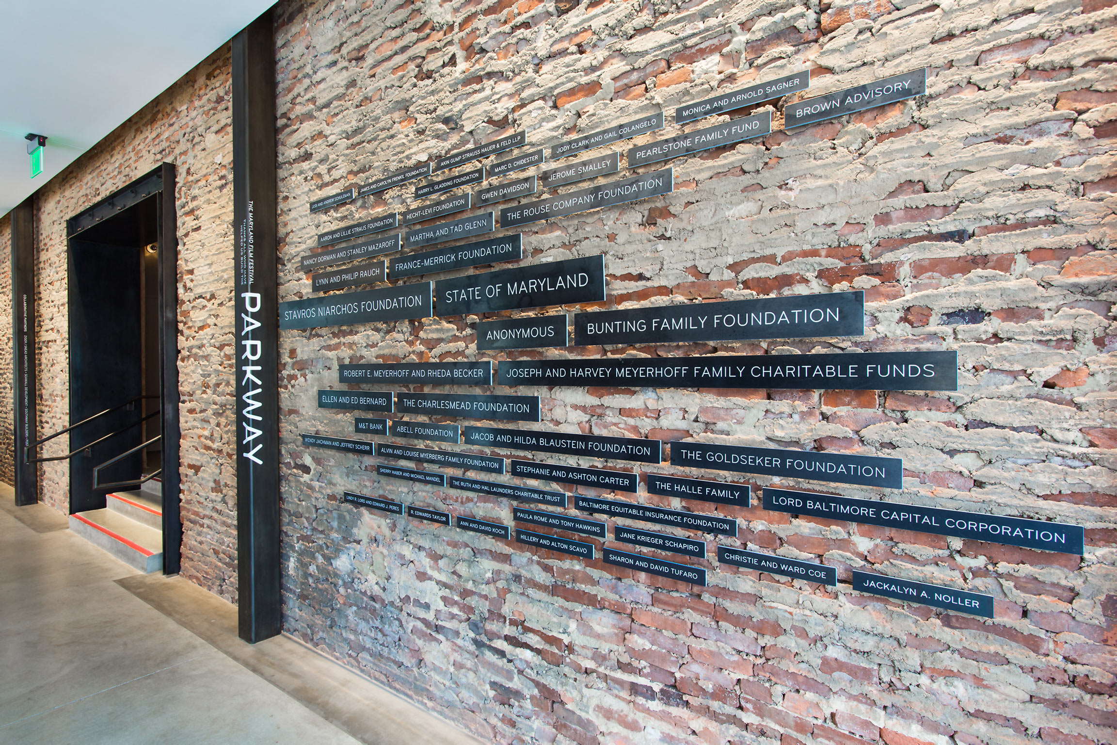
A sculptural donor wall harmonizes with the building’s exposed structural steel.
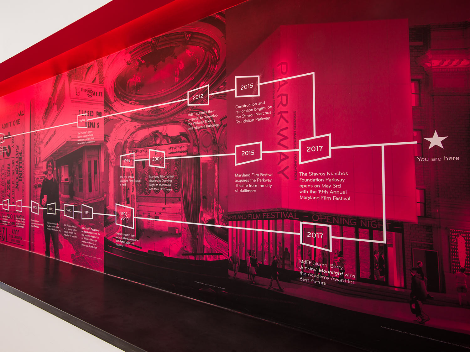
We seamlessly integrated expository signage into the building’s architectural features. Large-scale graphics that incorporate archival photography tell of the history and rebirth of the Parkway.
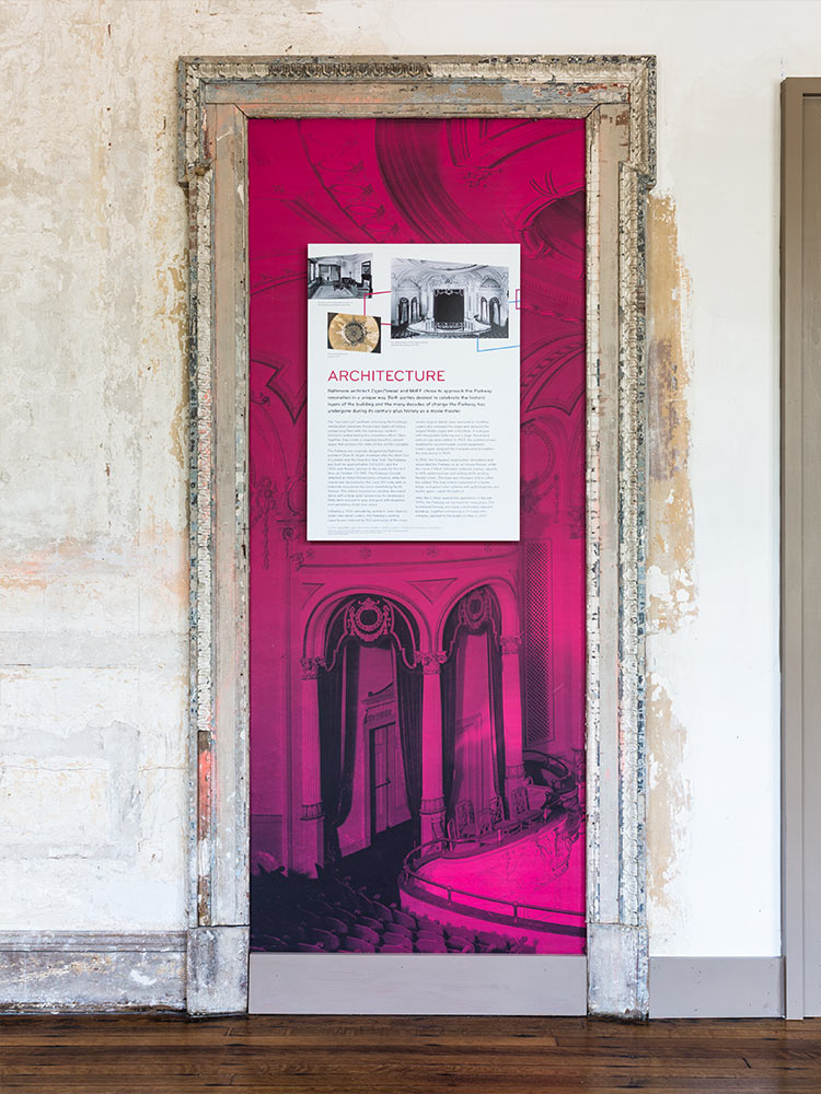
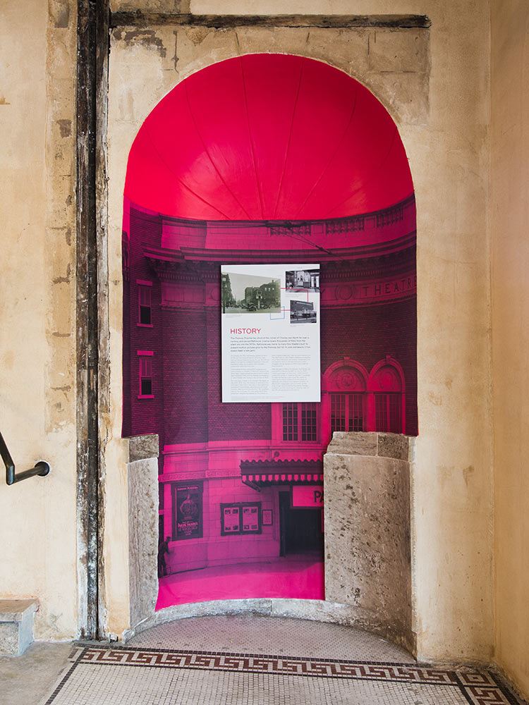
Scattered throughout the building, these colorful niches add to the Parkway experience and provide fun moments of discovery.
Designing a memorable experience
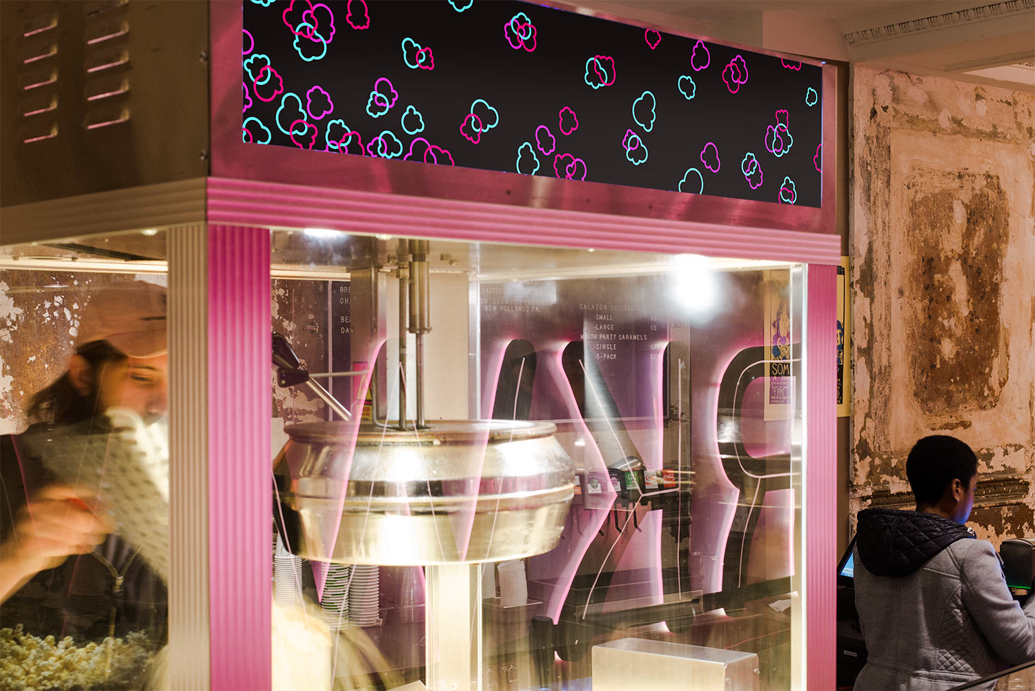
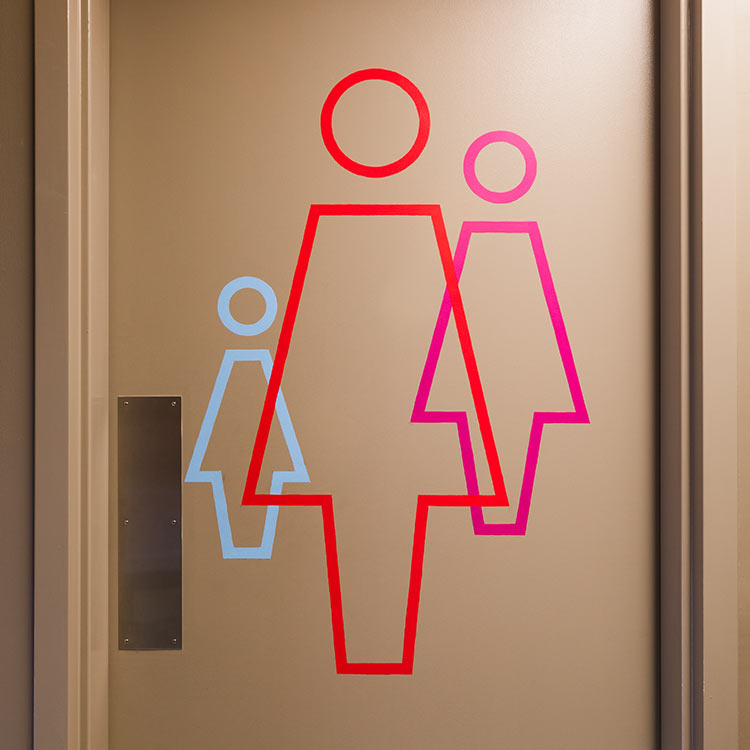
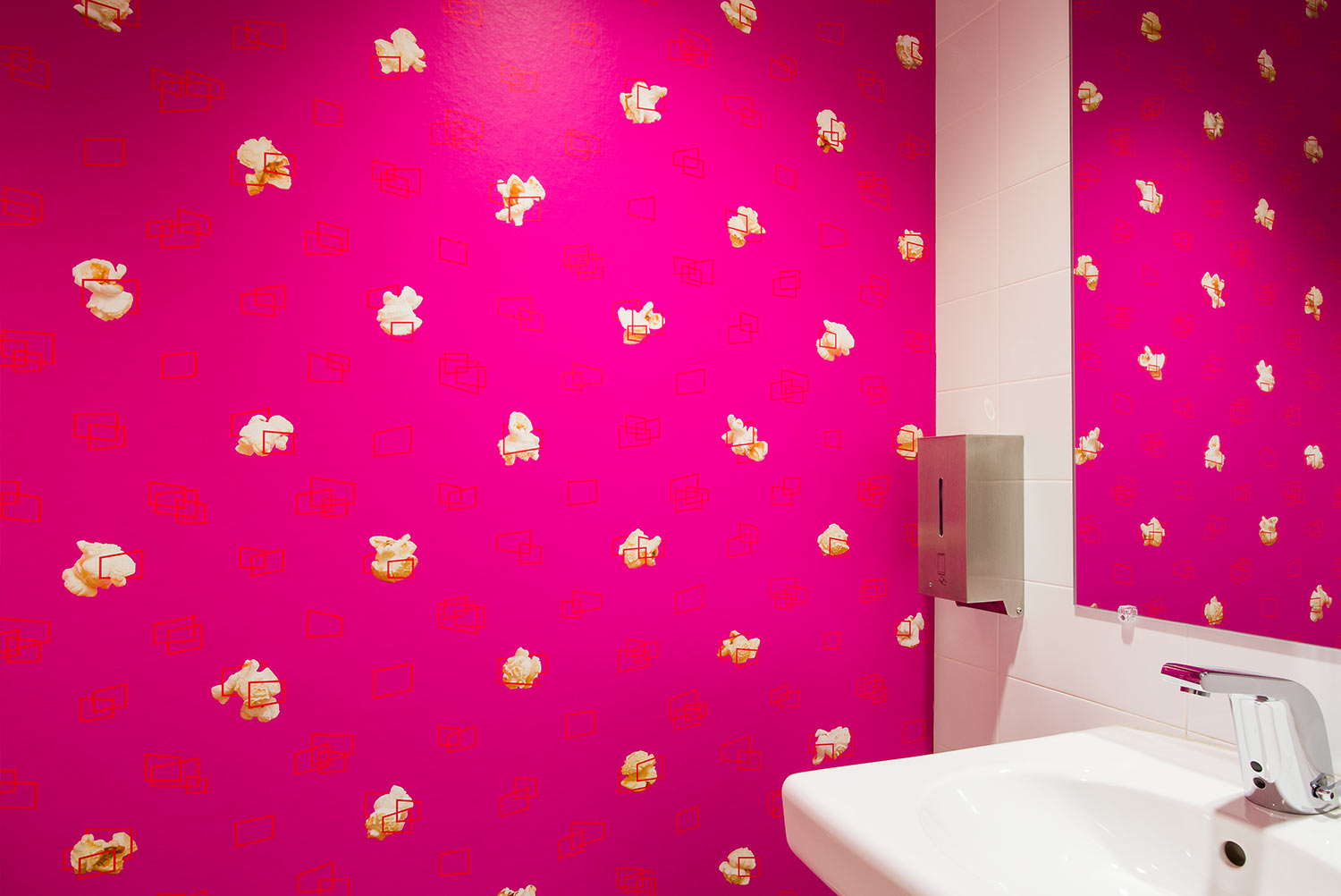
Visual easter eggs and unique design details enhance the Parkway experience — from an MdFF-branded popcorn machine to custom wallpaper in the bathrooms.
